Published:2024-07-12 10:04:43Source:JuxiaAuthor:Juxia
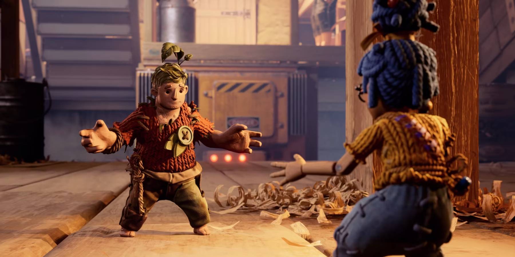
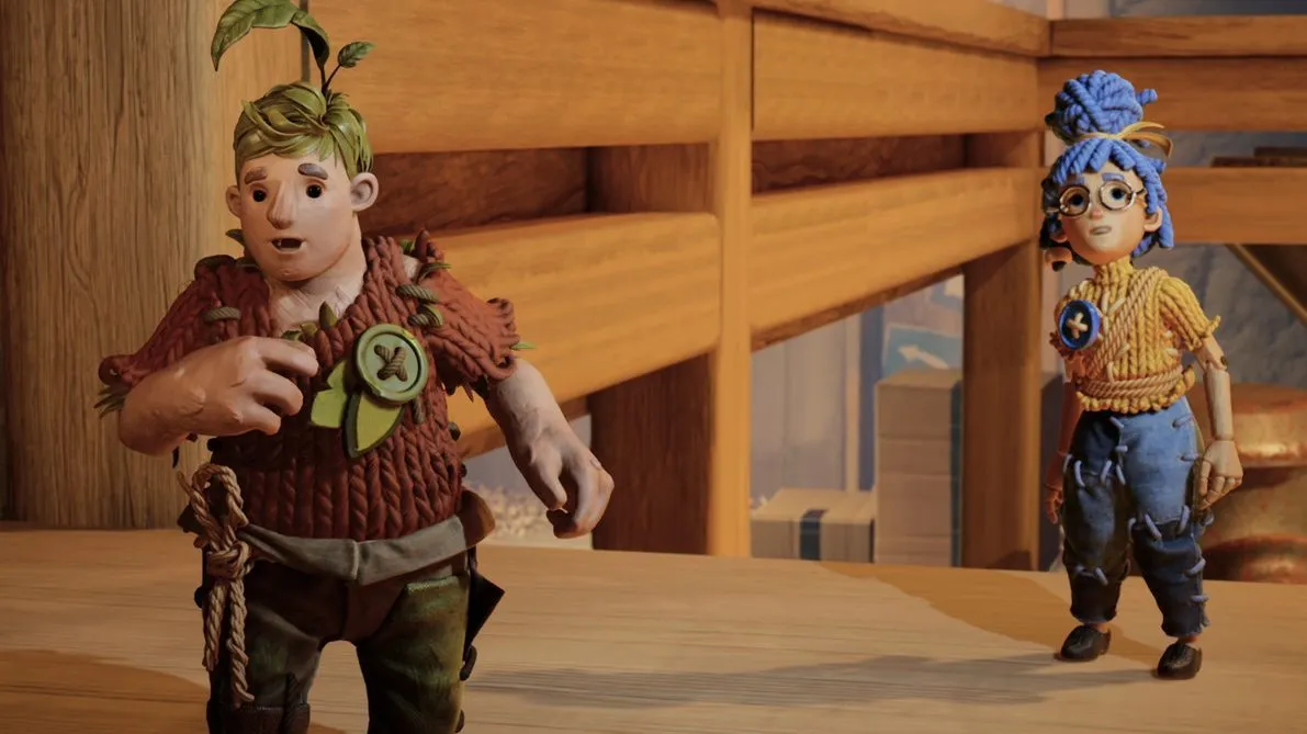
Originally, the co-op platformer It Takes Two was envisioned with a much darker tone, featuring voodoo dolls, metallic creatures, and a motif of hardware tools like hammers and screws. The early character designs were creepy, and the overall concept had a much grimmer atmosphere. However, the game's trajectory shifted, and it ultimately evolved into the successful, beloved co-op experience that it is today, praised by both fans and critics for its engaging and whimsical gameplay.
The 2021 Game of the Year award winner, It Takes Two, originated from a "darker" game concept as per developer Hazelight Studios. In a recent revelation, the It Takes Two creator shared insights into the game's early development stages in the buildup to the studio's 10th anniversary in November.
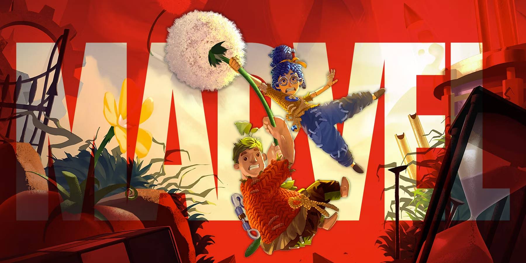
It Takes Two is the second game by indie developer Hazelight Studios, which came out on March 26, 2021. The co-op platformer garnered impressive scores from critics and raced past sales milestones after launch. Notably, It Takes Two also bagged several awards at the industry's major events, including winning Game of the Year at The Game Awards 2021. Over the years, the cartoonish game has continued to be a popular co-op title across platforms.
Through a Twitter post, Hazelight Studios unveiled that It Takes Two was "quite darker" in its "extremely early" concept stage. The studio also shared a few concept images from 2018, which capture the game's original dark and gritty tone, including creepy character designs and a motif of hardware tools like hammers and screws. Additionally, the studio shed light upon It Takes Two's codename during the development phase, which was "Project Nuts." In the comments, a fan replied that they would have "loved to see" the original dark take, while another amusingly suggested, "Please make [sic] It Takes Three."
The concept art shared by Hazelight Studios provides a glimpse into the game's early, darker vision. The character models depicted in these images resemble black voodoo dolls and metallic creatures, conveying a much more sinister aesthetic than the eventual cartoonish design. Additionally, the structures or platforms shown in the concept art feature an array of tools scattered around, further emphasizing the game's initial grim tone.
Judging from the early character concepts, it's clear that It Takes Two started out with plans of carrying an out-and-out dark look. The models of the doll with a nail hammered through its head and the tin spider suggest that the game may have had a creepier tone closer to the likes of Limbo and Inside. Moreover, the word "Nuts" in the original name and the strong hint of hardware tools, such as hammers and screws, in the logo's font suggest that their crucial role in It Takes Two's gameplay is an aspect that may have been conceptualized early on. The motif of tools, including nails, rulers, hammers, and the like, is evident across the platform game's concept images.
While fans will probably never get to experience how the dark version of It Takes Two would have felt, they can rest assured the changes the game underwent throughout development were for the best given its immense success. After delivering two highly rated story-focused co-op games in a row, namely A Way Out and It Takes Two, it will be exciting to see what Hazelight Studios builds next.
Juxia Figure Review - Hatsune Miku 100th Adventure Ver Preorder Now!
Juxia Game Review – WoW Midnight Deep Dive: Release Date, Player Housing, and Prey System!
Juxia Anime Review - 'The Demon King’s Daughter Is Too Kind!!' Anime Upcoming Adaptation!
Juxia Anime Review - OSHI NO KO Season 3 Release Date, Trailer, and Story Predictions!
Juxia Game Review - Koei Tecmo’s Atelier Ryza ASMR Hits DLsite!

Juxia Game Review - Elon Musk Just Challenged LoL Pros With Grok 5, and the Internet Is Losing It!

Juxia Game Review - The Ultimate Final Fantasy VII Remake Intergrade Switch 2 & Xbox Breakdown
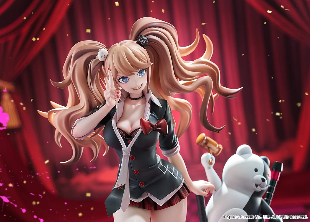
Juxia Figure Review – 15th Anniversary Junko Enoshima Figure Every Fan Needs!
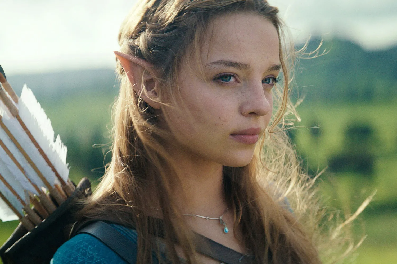
Juxia Movie Review - The Legend of Zelda Live-Action Movie Coming Soon!
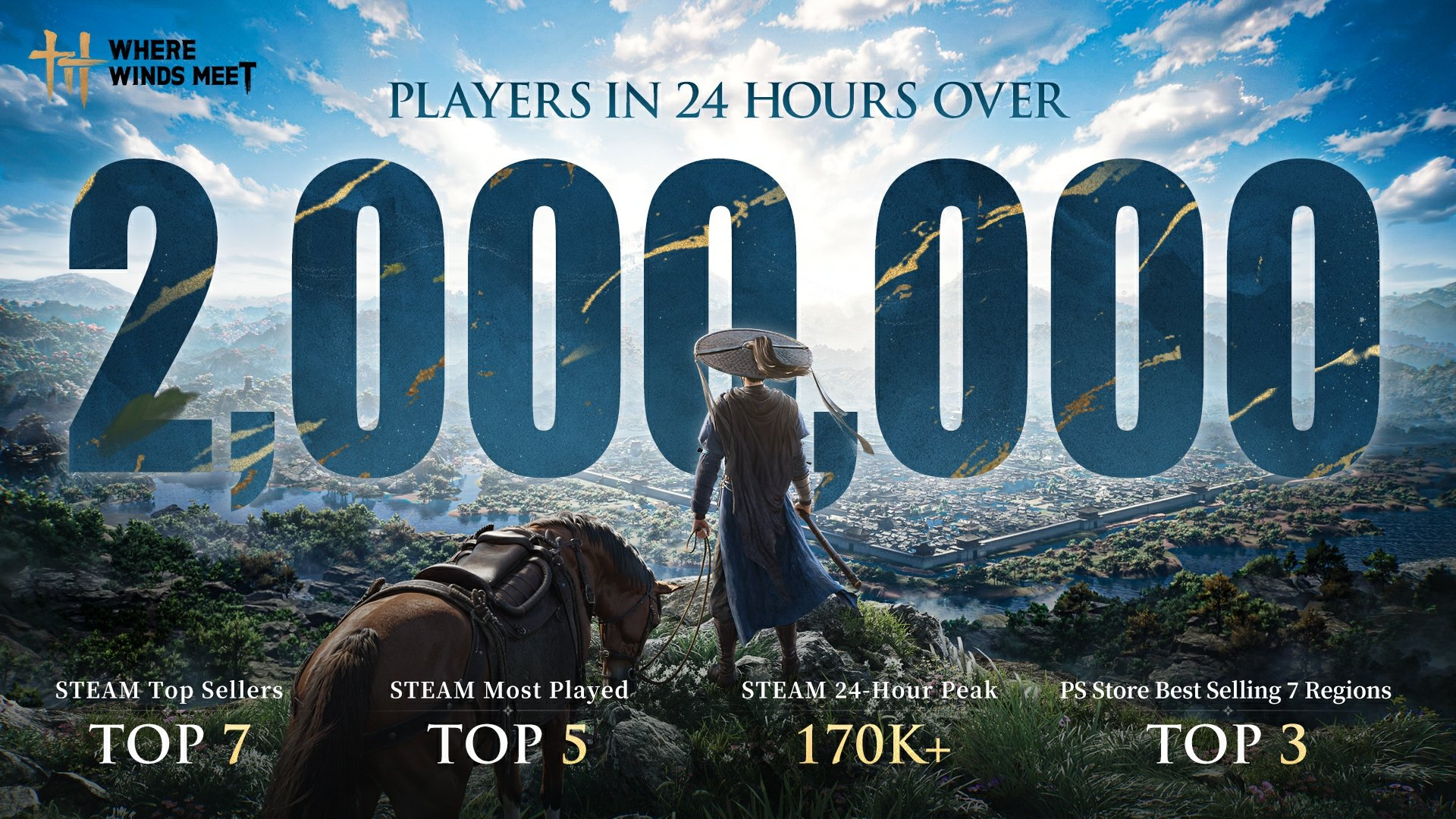
Juxia Game Review - Where Winds Meet Surged Past 2 Million Players on Day One!

DR Ramasjang LÆR
| Puzzle
Chimes (Tubular bells)
| Music
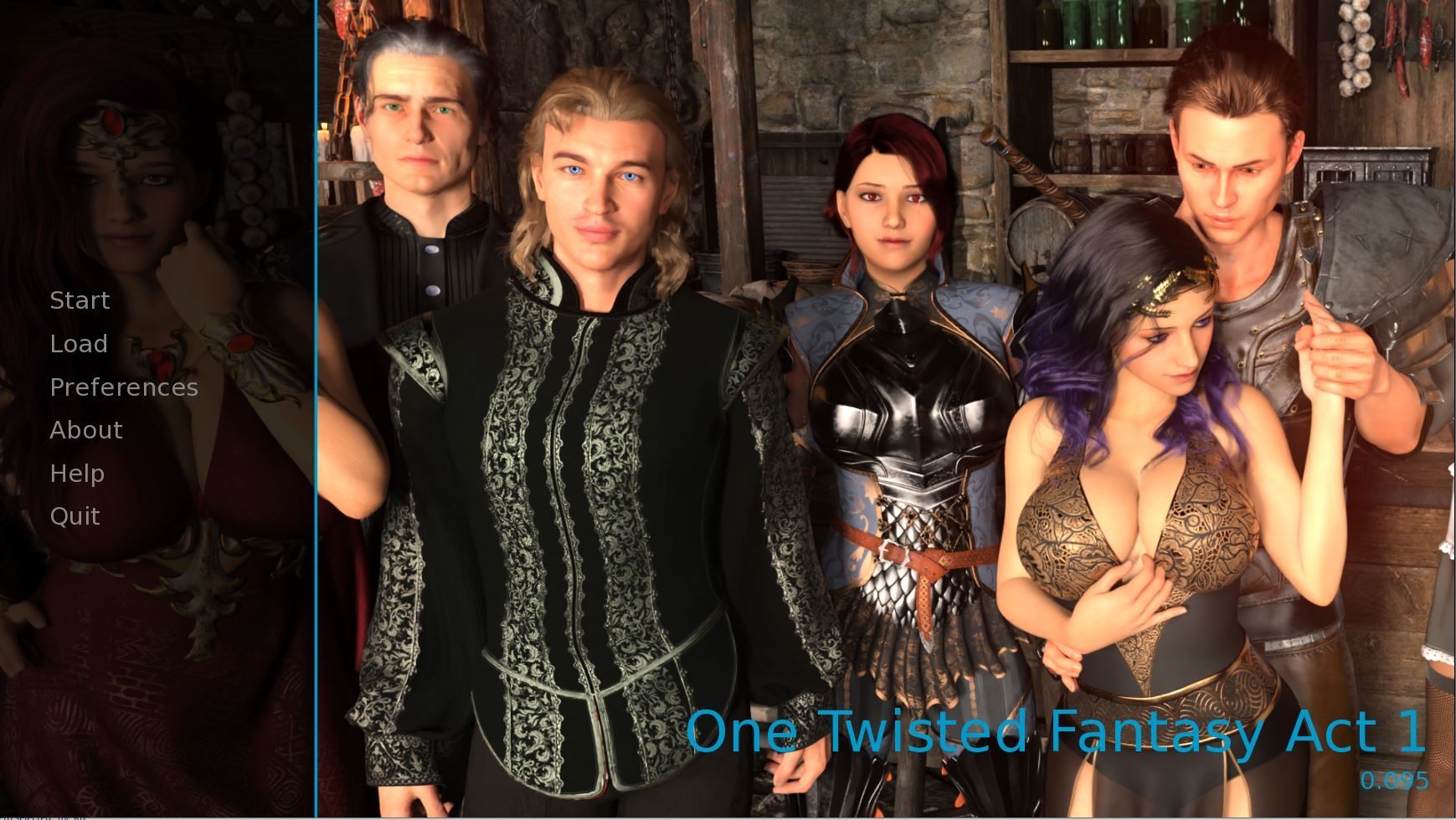
One Twisted Fantasy
| Shooting
I9: 인페르노 나인
| Role playing

Sort Mania
| Puzzle
TV Simulator 2
| Simulation

Bolt Escape 3D: Screw Puzzle
| Puzzle

Microwave Game
| Simulation
Juxia Game Review - Koei Tecmo’s Atelier Ryza ASMR Hits DLsite!
Juxia Anime Review - You Can't Be in a Rom-Com with Your Childhood Friends! Anime Adaptation
Juxia Anime Review - Why You Should Revisit Chained Soldier Explosive First Season
Transform Text and Photos into incredibly creative emojis with 'AI Emoji'
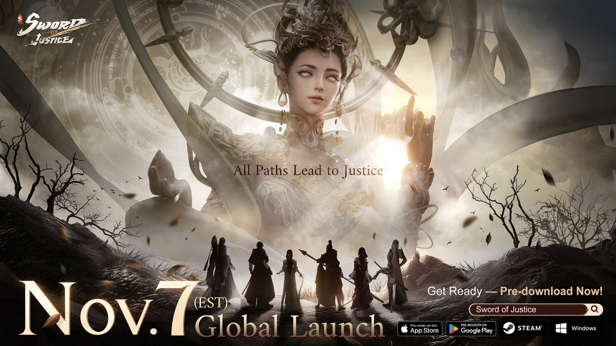
Sword of Justice Global Launches Soon - Everything You Must Know!
Sword of Justice Class Guide (7) - All School Classes Explained & Reviewed!
Sword of Justice Class Guide (6) - Sylph: Healing, Revival, and Grace in Battle!
Sword of Justice Class Guide (5) - Ironclad: Why This Rare Tank Class Is Worth Playing!
Sword of Justice Class Guide (4) - Numina: Master the Art of Poison and Tactical Combat!
LIVE A HERO
Retro Hero Mr Kim
Empire of Passion
Arcane Quest Legends
Magic Snap: Momotaro
AllStar Manga Heroes
Lunescape
ONE PIECE Thousand Storm JP
Tap Titans 2